Key features - click on each feature for more detail
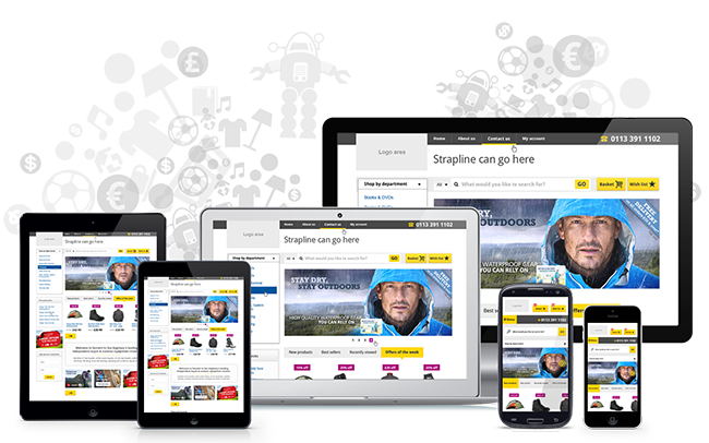
Optimised for mobile & tablets
It simply isn't an option any more to build websites purely for desktops. However it's a very significant task to build an effective strategy and solution to cater for any and every tablet and mobile device on the market today.

We use an approach called 'responsive design' and follow a principle of catering for every size device (rather than simply having a few breakpoints) where the website alters to nicely fit specific sizes. It has been common in the past for developers to create an iPad breakpoint and an iPhone breakpoint, thus having a website that works well on those sized screens but not really working great on other sized devices.
But with the enormous proliferation of different sized devices, both now and continuing in the future, it's vital to take the approach we are taking with handling every single sized screen now so we are prepared and ready for any device that might come out in the future.
But further still, with our single 'perfect' template, we are able to spend considerable time analysing every aspect of our template as to how it adapts for different sizes, as well as how it adapts to work effectively on touch devices (i.e. almost all mobiles and tablets) to ensure the best possible conversions on any device.
Mobiles
Very small screens require significant changes to the layout, prioritisation and functionality presented to the user and the way users interact with a website on their mobile device is likely to be very different to how they would interact on a desktop.
You can leave us to worry about this though and you can focus on your products, pricing, promotions, and a multitude of other aspects of running your successful retail business.
Tablets
In many ways we can take a similar approach on larger tablets as we do on desktops, but there are subtle differences and we will no doubt find many more tweaks in the future to optimise for these devices further.

